Add Charts to a Sheet
- 01 May 2026
- 15 Minutes to read
- Contributors


- Print
- PDF
Add Charts to a Sheet
- Updated on 01 May 2026
- 15 Minutes to read
- Contributors
- Print
- PDF
Article summary
Did you find this summary helpful?
Thank you for your feedback
If a sheet’s output type supports the use of charts, you can add them to the form design.
Refer to the information that corresponds to the sheet’s output data type:
EMF-Based Output (Lasernet Core 11, Lasernet Core 10, and Lasernet Essentials / Professional / Advanced)
Note
The following information applies only to PDF, TIFF, and EMF sheets whose underlying format is EMF.
The Charts tool allows you to define the data for a chart in the input and insert a chart image in the output.

To define chart data in the input, proceed through the steps listed below:
On the toolbar, click the little arrow next to the Charts tool and then click Create chart data.
When the pointer becomes a cross, mark the area to define the data to be shown in the chart. Or, for some input data types (such as XML), you can click the input data value.

Note
This example is based on text as input format, but collecting chart data is similar if XML is the input format.
If you want to edit the chart data, double-click the defined area. From the Edit Chart Data dialog, switch to the Chart Data tab.

See the table below to learn more about the tab controls:
Control
Description
Chart data name
A descriptive name for the chart data as defined in the input.
Replace existing chart data
If selected, any other chart data with the same name is replaced.
The next step is to define all of the data sets for the chart type. For example, label data is required for all chart types; XTitle and YTitle data is required for xy-charts only.
Note
A chart is an absolute rearrange and cannot be added to a pattern. It can only be added to the output. However, a chart can be located relative to different entities (for more details, see Position Properties).
To create the output object (a chart image), proceed through the steps listed below:
On the toolbar, click the little arrow next to the Charts tool and then click Insert chart image.
When the pointer becomes a cross, mark the area to define the chart position in the output.
When releasing the mouse, the Edit Chart dialog opens with the Chart tab.
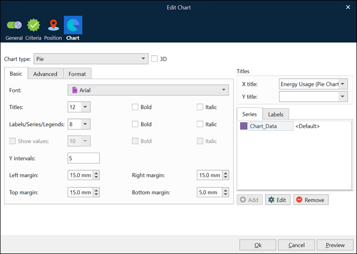
For detailed information about common controls, see Edit Rearrange Properties.
The table below has more information about output-specific controls.
Control | Description |
|---|---|
Chart type | Using the drop-down list, it is possible to select a chart type. |
3D | Select the checkbox to change the chart from a 2D to a 3D representation. |
X Title | Use the drop-down list to select the chart data value or add a fixed text title for the X-axis. |
Y Title | Use the drop-down list to select the chart data value or add a fixed text title for the Y-axis. The Y Title can contain an index with two values for “Pareto” and “Bar + Line” charts. The first value for the Y-axis title is positioned to the left, and the second value is to the right. |
Series | Allows you to define a series for the chart. Use the Add, Edit, and Remove buttons to manipulate the chart data values available in the tab. |
Labels | Allows you to specify the chart data value or add fixed text labels for the chart. Use the Add, Edit, and Remove buttons to manipulate the chart data values available in the tab. |
Basic tab controls:
Control | Description |
|---|---|
Font | Use the drop-down list to select the font to be applied to the X,Y Titles, Labels, Series, and Legends. |
Titles | Use the drop-down list to select the font size to be applied to the X and Y Titles. |
Labels/Series/Legends | Use the drop-down list to select the font size to be applied to the Labels, Series, and Legends. |
Show values | Select the checkbox to show the data labels for the data points for xy charts. |
Bold | Select the checkboxes to set the font style to bold for Titles and/or Labels/Series. |
Italic | Select the checkbox to set the font style to italic for Titles and/or Labels/Series. |
Y Intervals | Specifies how many value labels are displayed on the Y axis. |
Inner Radius | Defines the inner radius of the donut chart type. |
Left/Right/Top/Bottom Margin | Use to define the margin for each chart side. |
Advanced tab controls:
Control | Description |
|---|---|
Labels | Use the drop-down list to define how labels should be shown. The following options are available. XY charts:
Pie charts:
The default value is Horizontal. |
Hide border | Selecting the checkbox allows you to hide the borders of the plot area. |
Show Legend | Use the drop-down list to determine the legend location and visibility. The following options are available:
The default value is Hide |
Hide legend border | Select the checkbox to hide the legend borders. |
Transparent | Use the drop-down list to set the transparency of the chart (Yes/No). |
Y Axis | Sets the position of the y-axis on the plot area (left/right). The default is to the left. |
Gap | The amount of space between the bars (or between bar groups for multi-bar layers). Example: a bar gap of 0.2 equates to 20% of the distance between two adjacent bars. A bar gap of 0 means there is no gap between the bars. The bar gap can be negative. In this case, the bars will overlap. For multi-bar layers, the Gap refers to the amount of space between bar groups, while Spacing refers to the amount of space between bars within the bar group. |
Spacing | This parameter only applies to multi-bar charts. It is the amount of space between the bars in a bar group. |
Grid lines | Allows showing or hiding grid lines for a chart. To this end, select the required value from the drop-down combo box. You can select to show horizontal grid lines, or vertical ones, or both, as well as hide grid lines. |
Format tab controls:
Control | Descrption |
|---|---|
Left Y-Axis | The format string, using {value} to denote the axis labels for the left Y axis. For example, ${value|2.,} can be used to format the value to 2 decimal points, using “.” as the thousand and "," as the decimal separators respectively, and with a '$' sign in front. |
Right Y-Axis | The format string, using {value} to denote the axis labels for the right Y axis. The option is enabled for “Bar + Line” and “Pareto” chart types only. |
Values | The format string, using {value} to denote data labels for the data points. |
Legend | Defines the format of legend text. Parameter substitution is used to allow you to configure exactly what information is contained in the text and its format. For example, when drawing a pie chart with a side label layout, the default sector label format string is: "{label} ({percent}%)". When the sector label is actually drawn, Lasernet Core will replace "{label}" with the sector name and "{percent}" with the sector percentage. So the above label format will result in output that looks similar to "ABC (34.56%)". You can change the sector label format by changing the format string. For example: {label}: US${value|2} {percent}% The sector label will then become something like "ABC: US$123.00 (34.56%)". Note: This option only applies to Pie and Donut charts. |
Use regional profile | Select the checkbox to use the regional profile (for details, see the Regional Profiles section of the Lasernet Developer guide). It works as follows:
|
Once you have specified the required properties for the chart, click the OK button to insert a chart image.
Click the Preview button to preview a chart in the output, taking into account the properties you have specified (but without applying them).
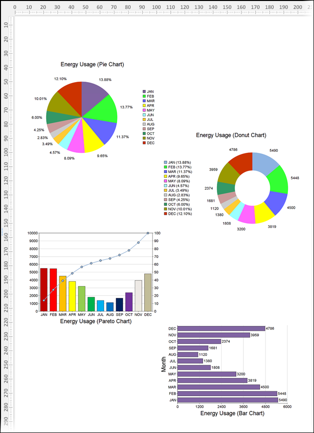
Once you have added the chart, you can resize and move it if necessary.
To resize the chart, hover over it and a sizing handle (a little square) appears. Click and drag the handle to make the table larger or smaller. The height and width ratio is maintained.
To move the chart, hover over it and a chart move handle appears. Using the chart move handle, drag the chart to the new location.
In addition, you can also change the corresponding values in the Edit Rearrange dialog to move and/or resize the chart.
To edit the chart you have created, right-click it and then click Properties or double-click the chart. The Edit Rearrange dialog opens. Use the controls described above to change the chart as required.
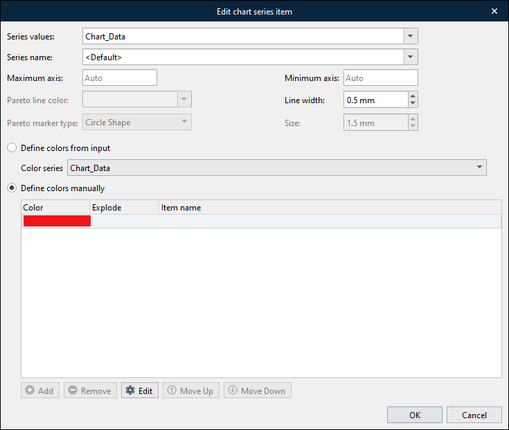
You can change a series you have specified using the Series tab of the Edit Rearrange dialog. To edit a series, select it in the list and click the Edit button, or double-click the series record. The Edit chart series item dialog appears.
Note
The list of controls and their availability varies depending on selected chart type.
The following table provides information about the various controls.
Control | Description |
|---|---|
Series layout | Available only for Bar + Line chart type. Defines which layout series is used for Bar or Line. |
Series values | Use the control to specify the chart data to be applied as a data set for the current series. |
Series name | Use the control to specify the name for the current series in the legend. By default, the name of the chart data selected within the Series values control is set. In addition, you can select another chart data available in the drop-down list, or type a fixed text to define a series name. If several colors are defined for the series (see Colors description below in this table), the selected chart data will be used to define the item names if they are not already specified. |
Format labels | For pie chart types only. Defines the format of label text. Parameter substitution is used to allow you to configure the information displayed and its format. The behavior is similar to that of Format Legend control described above. |
Maximum Axis | Use the control to specify the upper bounds of the Y-axis. Both negative and positive values are allowed. |
Minimum Axis | Use the control to specify the lower bounds of the Y-axis. Both negative and positive values are allowed. |
Pareto line color | Pareto chart type only. Use the control to specify the color of the accumulated line. |
Line width | Use the control to set the width of the line. |
Pareto marker type | Pareto chart type only. Using the drop-down list, you can select a marker type for the accumulated line. |
Size | Pareto chart type only. Use the control to specify the size of a marker. |
Specify Chart Colors
You can specify which colors the chart uses to represent this series:
Area, bar, bar + line, line, spline, stacked bar, step line, and trend charts: A single color represents the series. For example, the line color for a line chart.
Bar, Pareto, donut, and pie charts: Each segment or value has a different color. You can specify which colors to use.
In the Edit chart series item window, chart colors are assigned in one of the following ways:
For area, bar, bar + line, line, spline, stacked bar, step line, and trend charts: You select a single color for the series. See Select a Single Color for the Series.
For bar, Pareto, donut, and pie charts (which consist of separate chart items like bars or segments):
You can manually specify an ordered list of colors. Line items in the input data are indexed by their position in the data, and then their chart items are assigned the color that has the corresponding position in the color list. See Index-Based Color Assignment.
If the input data specifies which color to use for each line item in the input XML, you can specify which chart data series captures that color data. Lasernet Core will assign each chart item the color specified by the corresponding element in the input XML. See Color Assignment Based on Input Data.
Select a Single Color for the Series
Select Define colors manually, and then select a color for the single item in the color list.
Index-Based Color Assignment
The line items represented by the pattern defined in the input data are indexed by their position in the input XML. For example, in the following XML, the form defines a pattern on the product element. The first product element (for apple) is indexed 1, the second product element (for banana) is indexed 2, and so on. In this example, the form defines a Chart_Quantity chart series on the quantity element, and a pie chart in the form uses Chart_Quantity as its Series data in the Edit Chart window.
<sales>
     <department>Fruit</department>
     <month>January 2026</month>
     <item_data>
          <product>
               <item>Apple</item>
               <quantity>48773</quantity>
          </product>
          <product>
               <item>Banana</item>
               <quantity>87332</quantity>
          </product>
          <product>
               <item>Orange</item>
               <quantity>3454</quantity>
          </product>
     </item_data>
</sales>
Lasernet Core assigns colors to segments in bar, Pareto, donut, and pie charts according to their index position.
If chart colors are manually specified as a list, the first color in the list is assigned to the line item element indexed 1, the second color is assigned to element 2, and so on. However, as a result, the color used for the same item in different output documents might differ, if the line item element order in the XML differs for each job.
For example, if the first color in the list is red and Lasernet Core receives the XML above, the segment for the sales quantity for apples is colored red. But if the first product element in the XML for the next Lasernet Core job is for bananas, the segment for bananas is red.
Note
If it is important that the color used for each specific chart item is consistent between output documents, see Color Assignment Based on Input Data.
To use index-based color assignment, follow these steps:
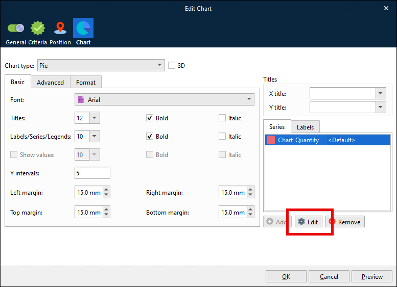
In the Edit chart series item window, select Define colors manually (see 1 in the image below).
Click the single item in the color list, and then click Edit (2).
In the Chart item customisation window, select an Item color, then click OK.
Click Add (3), select the new color list item, click Edit, and then select a color. Repeat this step until the list contains enough colors.
Note
If the number of colors in the list is fewer than the number of chart items, Lasernet Core loops through the color list.
Click OK (4) to save your changes to the chart series.
.png)
Note
For pie and donut charts, you can explode one segment.
To explode a segment, edit its entry in the color list and set Explode to Yes.
Note
For each segment or value in the chart, you can provide an item name for Lasernet Core to use in the legend box. Edit each entry in the color list and enter a value for Item name.
Color Assignment Based on Input Data
If each line item specifies a color, Lasernet Core can apply that color to the corresponding chart segment. This guarantees consistent segment coloring between output documents.
For example, in the XML below, each line item has a color. The form defines a chart series (Chart_Color) on the color element, and Chart_color is selected as the Color series in the Edit chart series item window for the Chart_Quantity chart series. As a result, Lasernet Core applies the Chart_color indexed 1 (red) to the chart segment that represents the Chart_Quantity that is indexed 1 (apple). If the next Lasernet Core job contained apple sales data as the second line item in its XML, apple’s sales quantity and color (red) would both be indexed 2, so the pie chart segment for apples would still be red.
<sales>
     <department>Fruit</department>
     <month>January 2026</month>
     <item_data>
          <product>
               <item>Apple</item>
               <quantity>48773</quantity>
               <color>red</color>
          </product>
          <product>
               <item>Banana</item>
               <quantity>87332</quantity>
               <color>yellow</color>
          </product>
          <product>
               <item>Orange</item>
               <quantity>3454</quantity>
               <color>orange</color>
          </product>
     </item_data>
</sales>
To assign colors based on input data, follow these steps:
Close the Edit Chart window.
Ensure that the input data contains supported color data values.
Note
You can use the following color value formats:
A name from the list of colors defined in the list of SVG color keyword names.
RGB
#RRGGBBEach of
RR,GG, andBBis a two-digit hex value.For example, magenta is
#FF00FF.
#RGBEach of
R,G, andBis a single-digit hex value.R,G, andBare repeated to form a#RRGGBBvalue.For example, magenta is
#F0F.
You can include or omit the preceding
#character.
In the toolbar, click Charts > Chart Data and create a chart data series that captures the color data. For the example above, this could be
Chart_Coloron thecolorelement.
Double-click the chart to open its Edit Chart window.
Click the chart’s data series on the Series tab, then click Edit.
In the Edit chart series item window, select Define colors from input.
Select the color data chart series from the Color series list.
Click OK to save your changes to the chart series.
.png)
Locate a Chart 'Relative To'
The following example will show you how to locate a chart relative to the bottom of a region. For more details about the ‘relative to’ options, see Edit Rearrange Properties.
In the output, define the region of data relative to where you want to locate a chart. The picture below shows a region of data to locate our chart against:

Add a chart and then edit it if required.
Open the Edit Rearrange dialog by right-clicking the chart and then clicking Properties or double-clicking the chart you have added.
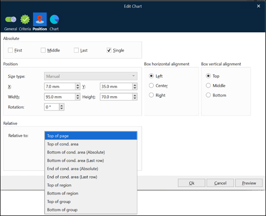
With the Edit Rearrange dialog open, switch to the Position tab.
From the Relative to drop-down list, select the preferred position on the page.
Once you are done, click the OK button.
The following image shows the result of locating the chart relative to Bottom of region.

Note
Once you have located the chart relative to the bottom of the region, the location of the chart is changed if a region is relocated.
The following image shows the difference (the Y-position for the region is modified).

Rich Text-Based Output (Lasernet Core 11 and 10 Only)
Click the Charts tool. The Form Editor will insert a chart at the cursor position, which you must design.
Drag data from a grab file to the relevant values or arguments area of the chart, or for more options right-click the chart, then click Run Designer.